An Introspective Look at WCET’s Own Accessibility Practices, Part I
Published by: WCET | 8/2/2019
Tags: Accessibility, Digital Learning, Disabilities, Innovation, Managing Digital Learning, Online Learning, Student Success, Technology, WCET
Published by: WCET | 8/2/2019
Tags: Accessibility, Digital Learning, Disabilities, Innovation, Managing Digital Learning, Online Learning, Student Success, Technology, WCET
Are your course materials and institutional websites accessible for all learners? Here at Frontiers, we discuss accessibility quite often, but today we have a very practical post that directly reviews content to determine accessibility for all. I’m excited to welcome Rosa Calabrese, WCET’s Digital Designer, who is here to discuss her review of the accessibility of our own content!
Thank you Rosa for this useful, albeit a bit vulnerable, post! We hope this review inspires others to ensure accessible design for their content as well.
Enjoy the read and enjoy your day,
Lindsey Downs, WCET
I spend a lot of time thinking about accessibility. As WCET’s digital designer, I am responsible for making our content as accessible as possible. Before coming to WCET, I had a bit of background in topics related to accessibility, but that was mostly from an academic standpoint. I have developed the majority of my skills in web accessibility since starting in this position.
A lot of what I know now about web accessibility I learned from:
As an organization, WCET talks with our members about accessibility a lot. We have countless other blog posts on the topic written by both staff and guest authors, and a significantly developed issue page on the topic. Every year at our Annual Meeting, we have multiple sessions addressing different aspects of accessibility and we have hosted a number of accessibility-related webcasts. Questions about accessibility come up regularly in conversation on wcetMIX, where our members discuss important topics in higher education. WCET, in conjunction with OLC, produced an Accessibility Survey of OLC and WCET Members report earlier this year to reflect on the way our member institutions interact with accessibility topics. It is clearly a topic that many of our members are very interested in, both for legal reasons and in order to provide quality access to education for all learners. Both WCET and WICHE try to meet Level AA WCAG accessibility standards.
Ever since the release of our accessibility report earlier this year, I have taken a more introspective look at how I ensure that our content is accessible. Beyond that, I want to know how successful I am in doing so. When we produced the accessibility report, I spent extra time making sure the report was accessible. I am satisfied with our final result, but the process made me question other aspects of WCET content. Plus, in order to maintain our position of authority in discussing topics related to accessibility, it is necessary that we are introspective about our own practices. Of course, we also must follow the same laws as everyone else!
I noticed something strange while doing research for this report: most of what I work with, and most of what I often see referenced online, is about accessibility for people with either hearing or vision impairments. While this makes some sense, (we live in a world saturated with limitless audio and visual media) it is also strange to overlook the many other disabilities that don’t fit into these categories, but likely have their own needs. Many of the conference sessions and meetups I’ve attended and the conversations I’ve had focus almost exclusively on vision and hearing impairments. As such, I’ve worked extensively over the years with color contrast, text weight, clean layouts, informative links, and using shapes and text in addition to color to give meaning. Meanwhile, we also use an out-of-house vendor to help us provide captions directly to our YouTube videos upon pre-request from people who register for our webcasts.
I have attended an entire conference session dedicated to learning how to write optimal alt text that perfectly describes an image without bias. I have also spent fifteen minutes working with others at a Meetup trying to determine if adding a drop shadow to text could make it accessible even if it doesn’t have high contrast with the background color (we concluded that it would be okay, but I avoid it whenever possible because it doesn’t seem like the best design). It is good to have these very specific conversations about accessibility because it helps us all understand the topics better. However, while we are narrowing our focus on these very specific issues, there are also larger accessibility topic areas that are hardly being addressed or are completely overlooked.
 I started out this process concerned that we do not do enough to provide accessible content for users with cognitive and neurological disabilities such as learning disabilities, ADHD (Attention Deficit Hyperactivity Disorder), and ASD (Autism Spectrum Disorder). However, as I researched, I realized that we had left out more than just those. The World Wide Web Consortium (W3C) provides five categories of accessibility: auditory; cognitive, learning, & neurological; physical; speech; and visual.
The W3C website also offers additional information about each topic. Below, I compare the list that W3C provides as possible barriers for people with each type of disability with what we at WCET are doing to prevent these issues. Today we’ll review possible barriers for two of these categories and continue with the rest of the list in my next post on this topic.
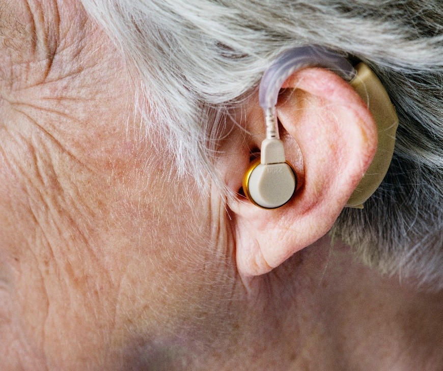
According to W3C, the following bulleted items are possible barriers that someone with an auditory disability might encounter:
 We had already started addressing this category and our content and materials do a good job of preventing these barriers from being an issue. We can accommodate captioning on our videos and provide interpreters for live events. We upload our videos into YouTube, which from what I can tell, does have flexible options regarding caption text size and colors. The one item that I will note that we do not provide is sign language to supplement important information. However, I am unsure that we have any content that is too difficult to read and would require this supplementary material.
According to W3C, the following bulleted items are possible barriers that someone with cognitive, learning, and neurological disabilities might encounter:
In reviewing the items listed above, I think that WCET does an okay job of preventing barriers for users with cognitive, learning, and neurological disabilities, but there is plenty of room for improvement.
WCET uses navigation and page layouts that we hope are easy for users to understand. The WCET website was launched a few years ago. We have made some alterations to the content structure since it was first launched because of a need to add a few new sections and to remove a few outdated sections, but we hope that the menu and content organization remains intuitive. Our other websites, which include the sites for the State Authorization Network, for Every Learner Everywhere, for the Frontiers blog, and for wcetMIX, were all either created or redesigned recently and we hope that these all have intuitive structures as well.
 One possible issue with our content for cognitive, learning, and neurological disabilities, is that we do have a fair amount of longform text, especially between our research on the SAN site and blogs posted on Frontiers, some of which addresses tricky and complicated subjects. On both platforms, we do our best to break up text using things like bullet points, paragraph breaks, and media. However, as most of our content does not lend itself well to visual aids, much of the visuals that we add are stock photos, which may or may not be very useful.
Lastly, I do not believe that we currently have any moving graphics that are unable to be turned off in any of our content, but I plan to poke through our pages to ensure that this is true. According to 3PlayMedia, this subject also applies to the use of GIFs on websites or in social media, which can cause dizziness, nausea, or distraction among users. Not to mention, the use of GIFs can also pose a problem for users with visual disabilities unless there is adequate alt text to explain the content of the GIF. Thankfully, I believe that GIFs can typically be turned off when used on social media, and we don’t use them often anyway. I will nonetheless be reviewing our past content as well as our current content standards to make sure that GIFs and other animations don’t get in the way of our ability to maintain accessible content.
Join us again on Monday for the rest of this post, where I explain the remaining three types of disabilities according to The World Wide Web Consortium and what WCET is doing to address each one of them.

Rosa Calabrese
Manager, Digital Design
WCET – WICHE Cooperative for Educational Technologies
rcalabrese@wiche.edu

1 reply on “An Introspective Look at WCET’s Own Accessibility Practices, Part I”
[…] Check out my first post for background information on what led me to write about this topic, and my explanation of auditory disabilities as well as cognitive, learning, and neurological disabilities. Stay tuned here for my overview of how we manage to keep our content accessible for users with physical disabilities, speaking disabilities, and visual disabilities. […]